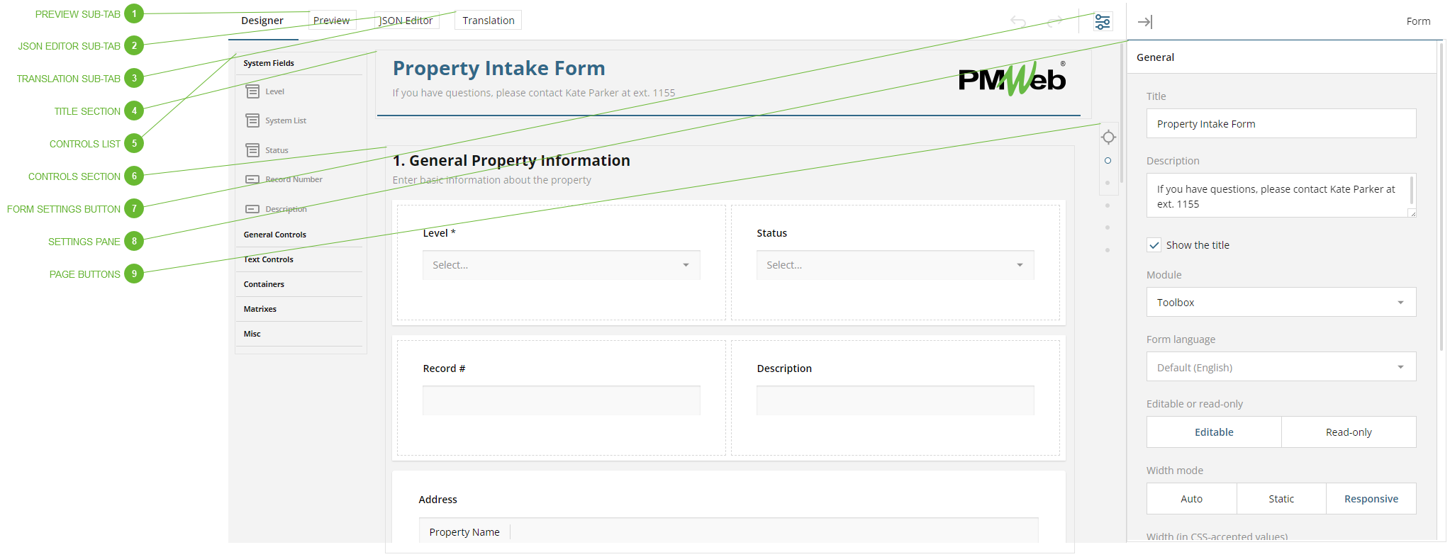
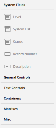
Drag a control from this list and drop it in the Controls Section to add it to a specific location in the form or click it to automatically add it to the current page. Controls are organized in the list in vertical sections, by type. Click a section title to see its controls.
System Fields
This section contains special controls that are already part of the PMWeb database.
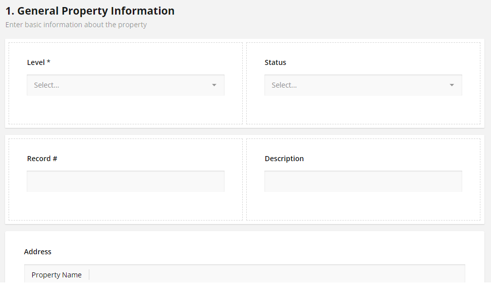
Level control
How you configure this control determines what PMWeb level the form is defined at and, therefore, its most basic level of permissions. (Permissions can then be refined using the Assign Permissions Tab.) Forms can be defined at these levels:
System, Program, Project, Initiative, Location Program, or Location. Drag the Level control from the Controls List and drop it in the Controls Section (or, if it is already in the Controls Section, click on it to highlight it) and then configure it in the System section of the Settings Pane. Important things to know about the Level control:
You must add the Level control to the form. PMWeb will not allow you to save the design if it does not include the Level field.
You can only add the Level control once. PMWeb will alert you if you add it a second time.
Make sure you use the System section of the Settings Pane to configure the Level control by selecting System, Program, Project, Initiative, Location Program, or Location
Select System in the Settings Pane if the form is not directly related to a program, project, or location
If you choose System level in the Settings Pane, you can hide it in the form, since users will not need to make a selection with it. In this case, make sure that you uncheck the "Required" parameter for the Level field.
System List control
This control is a dropdown based on a list that is already defined in Selection Lists. Use the System section of the Settings Pane to determine which system list to link it to. Note that you can also add dropdowns that are not based on previously defined Selection Lists. To do that, use the Dropdown control that can be found under General Controls.
Status control
This is the Status Field found on most PMWeb record types. If you enable Visual Workflow for this form, the status will be automatically updated as the record moves through the business process. You are not required to add the Status control to a form, even if you plan to enable Visual Workflow for it.
Record Number control
This is the Record # field found in most PMWeb record types. By default, PMWeb automatically increments this ID when a new record is added. You are not required to add the Record Number control to a form.
Description control
This is the Description Field found in most PMWeb record types. You are not required to add the Description control to a form but note that if you do not, no description will appear in the record selector dropdown in the Header Toolbar and in other places across the platform.
General Controls
This section contains controls that allow users to add data to the form by making selections, as opposed to entering text. Use the Settings Pane to configure each control as you add it to the form.
Radio Button Group - Users click a radio button to select a single answer from multiple options
Rating Scale - Users select one number within a range
Checkboxes - Users click one or several checkboxes to select answers
Dropdown - Users select a single value from a drop-down list. This differs from the System Dropdown control (see above) in that the list values here are unique to this field and do not exist elsewhere in PMWeb.
Multi-Select Dropdown - Users select one or more values from a drop-down list
Yes/No (Boolean) - Users enter yes (true) or no (false) with a switch control
File Upload - Users upload a file to the form record. Allow multiple files by checking the option in Settings Pane/General. Use the Selected file types parameter to limit file types.
Image Picker - Users select one or more images or videos from a series saved with the form
Ranking - Users drag and drop items in a list to show rank or preference
Text Controls
This section contains controls that allow users to add data to the form by entering text.
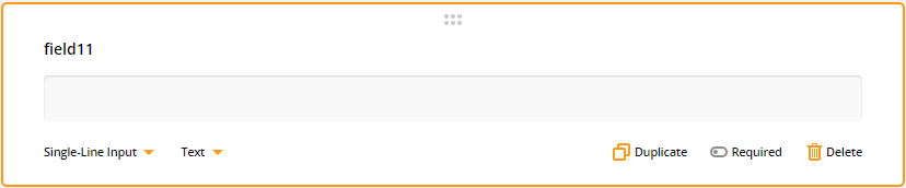
Single-Line Input - Users type one line of text to enter data. You can select the data type for this control.
Long Text - The same as Single-Line text except allowing multiple lines of data
Multiple Textboxes - Several single-line textboxes grouped in a special type of pane
Containers
This section contains two types of panels that can be used to group controls on the form.
Panel - Use these to group multiple controls
Dynamic Panel - Like the regular panel except that users can add and remove fields on the fly
Matrixes
This section contains table-like controls that allow users to enter data in rows and columns.
Single-Select Matrix - This control displays radio buttons in rows and columns. Users can select one radio button per row.
Multi-Select Matrix - This control can display multiple control types in rows and columns. Click a column heading to select it and then use the Settings Pane to configure the control type for that column.
Dynamic Matrix - This control is similar to the Multi-Select Matrix but users can add and remove rows on the fly
Misc
This section contains diverse controls that don't fit in the sections described above.
Expression - Use this control to calculate values and display them on the form record. Use curly brackets "{ }" to reference other fields. See Built-in Functions.
Image - Use this control to add a static image or a video to the form
Signature - Users can draw their signature (or anything else you want them to draw) within the input area
This section holds the controls that will appear on the form. Controls can be added by dragging and dropping from the Controls List or by clicking the Add Field button:
When you click the Add Field button, a default single-line input text field is added. You can then use the controls below the field and the parameters in the Settings Pane to select a different type of field and make other configuration choices:
Controls can be dragged within this section to change their location. Click on a control, including pages, to load its parameters in the Settings Pane.
The Settings Pane displays parameters for the currently selected page or control in the Controls Section, as well as the form level parameters. Configuration choices vary by control, and can include:
Title and description
Visible and required options
Conditional and calculated expressions in the Logic section - see Built-in Functions
Layout choices
Data options
Validation rules
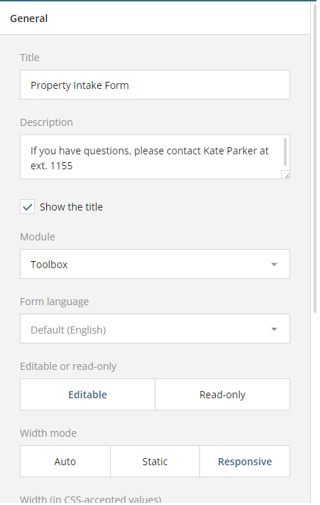
Form level parameters
The form level parameters include:
Title and description
Module - Select from which menu users will access the form
Form language - Select the default language for the form
Editable or read-only choice
The page width and adaptive behavior
Navigation options
Question - General control configuration
Pages - Add, delete, and name pages
Logic - Form level calculations and triggers
Data options, including validation procedure
System control parameters
If the selected control is a System control, a System section appears in the Settings Pane.
Level field - Select the PMWeb level for the form: System, Program, Project, Initiative, Location Program, or Location
System List - Select the PMWeb list, standard or custom, to use in the control
Status - There are no special System settings for this control so the System section does not show in the pane
Record Number - There are no special System settings for this control so the System section does not show in the pane
Description - There are no special System settings for this control so the System section does not show in the pane


