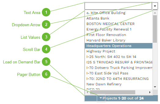
The combobox control is a dropdown list that is optimized to work in a Web application. PMWeb comboboxes feature a dropdown list of values to select from, load on demand to maximize responsiveness, and type assist to automatically filter as you type.
Text Area
As you type in this area the list values are automatically filtered. (This feature is called "Type assist".) When you click a value in the list its text appears here and fills the data field. Clear the text in this area to reload the unfiltered list.
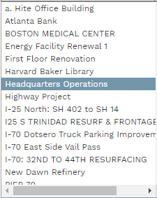
The available values appear here. Click a value to insert it into the data field. Note that the values that appear here vary depending on the data field that the combobox is associated with.
This bar displays the load on demand status of the list. Values are displayed in pages and pages are not loaded until requested by the user. This minimizes data exchange with the Web server, making the control faster and "lighter" on the page. Pages are automatically loaded when you use type assist in the text area or the scroll bar.
